
Every graph was data once
Somewhere in a manufacturer's PDF is the pump curve you need. Forty impellers, six families of lines, an efficiency envelope, and a NPSH curve running along the bottom. You need eleven numbers off it. The numbers exist — they existed as a table, once, on someone's machine, in 1994 — but what you have is a picture of them.
This is most technical reference material. Performance curves in a datasheet. A figure in a paper whose supplementary data was never published, or was published to a university server that stopped answering in 2011. A fan curve in a catalogue. A stress-strain plot in a textbook. A chart in a competitor's brochure. The data behind the picture is gone, and the picture is the only copy.
So people do what they've always done: print it, lay a ruler on it, read off the gridlines, and type numbers into Excel. Or they eyeball it and write down what looks about right, which is faster and worse. The general-purpose digitizers exist and they work, but they're built to hand you a CSV of x,y pairs and stop there — which is the beginning of the job, not the end of it. What you actually needed was eleven curves, organised, labelled, in a workbook, with a picture showing where you took them from.
Zenith Data Extractor is built for that job. You load the image, tell it where the axes are and what they mean, trace the curves you care about, and it gives you a spreadsheet.
Turn any graph back into data.
A tracer, not a guesser
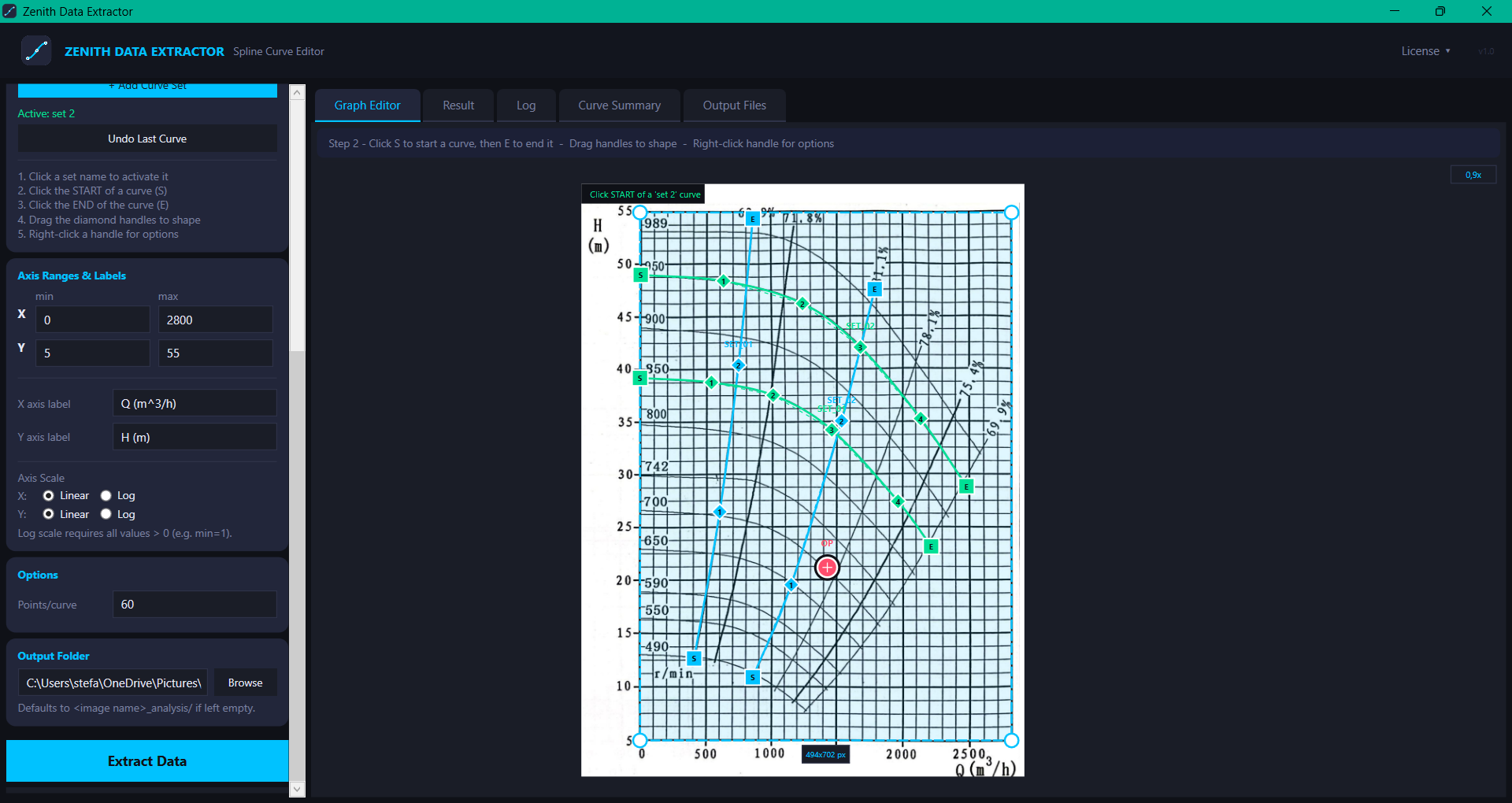
Automatic extraction is the obvious idea and it's the one that doesn't survive contact with real graphs. Auto-tracers follow colour. Real charts have dashed curves, curves that cross, curves that run along a gridline for half their length, annotations sitting on top of the data, JPEG artefacts, and a scanned-in grey wash over everything. The tracer does something confident and wrong, and you spend longer fixing its output than you would have spent doing it yourself.
So the extractor doesn't guess. You place the curve.
Click the start of a curve, click the end, and three handles appear: a square at each end and a diamond in the middle. Drag the diamond onto the curve. That's usually enough — a three-point Catmull-Rom spline lands on most pump curves and fan curves closely enough to argue about. When it isn't enough, right-click a handle and add another; the handles redistribute themselves evenly along the current spline, so adding a fourth doesn't throw away the shape you already had.
A magnifier follows the cursor at 4x, tucked into the corner of the canvas, so you can put a handle on a line that's two pixels wide without leaning into the monitor. Scroll to zoom, middle-drag to pan, double middle-click to reset.
The whole interaction is one idea: you know where the curve is, the software doesn't, and the software's job is to make it cheap for you to say so.
The axes are the calibration
Before any of the tracing means anything, the picture has to be told what it is. That's two steps and they're the ones worth being careful about.
First, drag a box around the plot area — the actual axes, corner to corner, not the whole figure. Drag the corner handles to nudge it until it's on the axis lines. This rectangle is the calibration: everything downstream is a proportion of it.
Second, type in what the axes say. X min, X max, Y min, Y max, and the labels. Nothing is guessed here and nothing is defaulted to a domain — the fields start empty and at zero, because there is no sensible default for "what does this graph measure." You're reading four numbers off a picture and typing them in. It takes fifteen seconds and it's the only part of the process where a mistake is invisible.
Log axes are supported on either axis independently, which matters more than it sounds: a good half of published engineering charts have a log scale on at least one axis, and a linear-scale extraction of a log chart produces numbers that look plausible and are entirely wrong.
Curve sets
A real chart is not one curve. It's a family of them — head curves for six impeller diameters, and then a separate family of efficiency curves, and then power draw underneath.
So curves belong to sets. You make a set, name it, and it takes a colour from the palette. Every curve you trace while that set is active belongs to it and inherits its colour, and gets labelled automatically from the set name: HEAD_01, HEAD_02, EFF_01. Click another set's row to make it active and keep tracing. Delete a set and its curves go with it.
This sounds like housekeeping and it's actually the thing that makes the output usable. Sets are what become the sheets in the workbook. Without them you get forty anonymous columns of x,y pairs and a sorting job.
The operating point
One extra thing you can drop on the canvas: an operating point. Click once in OP mode and a crosshair lands where you clicked; drag it to nudge, right-click to remove.
It exists because the most common reason to digitize a pump curve is that you want to know what happens at one specific duty point, and the point isn't on any of the curves — it's the place where your system curve crosses. Marking it means it comes out in the workbook as a labelled pair, in its own sheet, alongside its pixel coordinates, and it shows up on the annotated image so the person reading your report can see the same thing you saw.
What comes out
Hit Extract Data and you get four things in a folder.
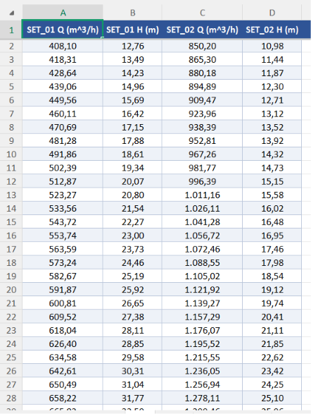
An Excel workbook, which is the actual deliverable:
Summary            one row per curve: label, set, point count, X range, Y range
<Set name>         one sheet per curve set, wide format —
                   two columns per curve, X and Y, headers from your axis labels
Operating Point    the duty point, in axis units and pixel coordinates
Formatted properly, incidentally — frozen header row, banded rows, thin borders, columns sized to their contents. Not because a spreadsheet needs to be pretty but because a workbook that looks like a printout gets pasted into reports without anyone reformatting it first.
An annotated PNG: your original image, cropped to exactly the plot area you selected, with the extracted curves drawn over the original ones and the operating point marked. This is the evidence. It's rendered at up to 4x supersampling with a long edge around 3200 px, so it survives being dropped into a document at full width. When someone asks where the numbers came from, this is the answer, and it's the artifact that lets a reviewer see at a glance that your trace sits on the line rather than beside it.
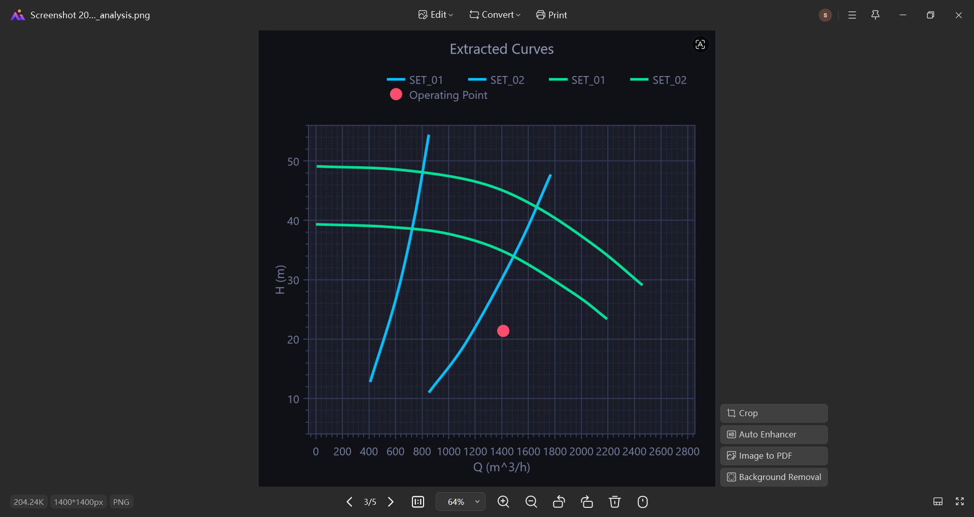
A data plot PNG: the extracted curves as a clean chart, rendered at 300 dpi, on the axis scales you specified. It's what the graph would look like if the data had never been lost.
And a summary table in the app itself, so you can sanity-check the ranges before you send anything to anyone.
What it deliberately doesn't do
It doesn't trace curves for you. Covered above, but worth stating as a design position rather than a missing feature: there is no colour-detection auto-extract, no "find all the lines" button, and adding one would make the tool worse at the charts it's actually for.
It doesn't read your axes. There's no OCR on the tick labels. You type the four numbers. This is a real cost — it's the one step a machine could plausibly do — and it's also the step where being wrong is worst, so it stays manual and explicit.
It doesn't fit anything. You get points, not equations. There's no regression, no polynomial fit, no "find the affinity law," no curve algebra. The output is a table of coordinates and the fitting happens wherever you normally do it. A tool that both extracts data and fits models to it invites you to trust the fit without ever looking at the extraction.
It isn't a chart tool. The plot PNG it produces is a check on the extraction, not a figure for publication. If you need a real chart, you have the data now — put it in whatever you normally use.
It doesn't do 3D plots, contour maps, ternary diagrams, or pie charts. It reads 2D line graphs on rectangular axes, linear or log. That's the shape of nearly every engineering performance chart ever printed, and it's the whole target.
It doesn't collect telemetry. Your images never leave your machine; the extraction is entirely local. The one network call it makes is the licence check when it starts, which asks whether your key is valid and gets told yes or no.
The design philosophy
There's a quiet assumption in technical work that the numbers are somewhere. That if you really needed them, you could get them. Mostly this isn't true. An enormous amount of engineering reference data exists only as pictures of itself — plotted once, printed, scanned, PDF'd, and passed around for thirty years — and everyone downstream of the original spreadsheet is reading a graph with their eyes and rounding.
That rounding has a cost, and it's not usually a dramatic one. It's a duty point that's four percent off, a pump that runs slightly left of its best efficiency, a margin someone padded because they didn't trust their own reading of the chart. Small, defensible, invisible errors, made by competent people, because the alternative was a ruler.
The premise here is that getting the numbers back should take four minutes and produce something you can show your reviewer. Not a CSV you have to explain, but a workbook and a picture of where it came from — so that the extraction is auditable, arguable, and can be redone by someone else who thinks you put a handle in the wrong place.
The graph was data once. It should be possible to get it back.
Zenith Data Extractor is a desktop tool for pulling numeric data out of published graphs, for engineers and scientists who work from datasheets, papers, and catalogues, available for Windows on perpetual licensing.